

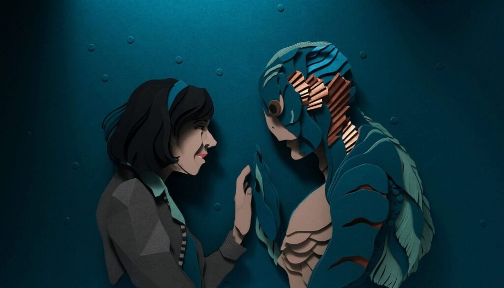
John Ed De Vera turns layered paper into bold, three-dimensional portraits and scenes that read like film stills—works where light, shadow and color create narrative tension as vital as the subjects themselves.
Working at the edge between illustration and sculptural relief, John Ed De Vera approaches paper as both pigment and structure. His method pushes beyond flat graphics: stacked planes, razor-clean contours and calibrated shadows stage an optical drama that recasts familiar iconography through a contemporary lens.
What happened
Across recent bodies of work, De Vera refines a language of layered cuts that amplifies volume, expression and motion. Portraits, cultural figures and urban vignettes emerge from carefully engineered strata, each slice contributing to depth, rhythm and narrative clarity. The result is an unmistakable signature: crisp silhouettes, saturated palettes and a sense of kinetic focus that feels almost cinematic.
How it’s built
De Vera’s process is architectural in spirit. Starting from sketches, he separates forms into tiers, assigning each plane a role—foreground, mid-ground, highlight, shadow. He then cuts, stacks and adheres heavyweight papers with micro-precise alignment. Edges become ink lines; cavities become shadows. This grammar of cuts and voids replaces brushwork with relief, letting the material itself deliver contrast, glow and dimensionality.
Sources and references
While the subjects often nod to pop culture, design history and urban folklore, the compositions avoid nostalgia. Instead, De Vera leans on graphic reduction—economy of shape, controlled color, assertive negative space—to distill recognizability without cliché. Type, costume details and architectural motifs surface as structural cues, guiding the eye through layers like a storyboard.
Material intelligence
Paper’s physical limits are central to the work’s impact. By treating the sheet as both skin and skeleton, De Vera harnesses its flexibility for contour and its rigidity for span. Subtle offsets between layers generate parallax: a turn of the head, the curve of a jacket, the flicker of a neon sign. The build reads clean from afar and resolves into meticulous craft at close range.
Dialogues in paper
De Vera’s practice sits within a broader conversation around contemporary paper art—where sculptors, illustrators and set designers reimagine the medium for our image-saturated era. In that lineage, consider how nature-driven reliefs expand the field; for instance, see how another practitioner explores material tactility and organic form in this in-depth feature on paper botanicals: Ann Wood’s paper sculptures. The comparison underscores paper’s range—from graphic portraiture to lifelike natural studies—without abandoning the medium’s inherent honesty.
Why it matters
In a culture dominated by frictionless screens, De Vera’s reliefs restore resistance and time to the image. Their physical construction—cuts that can’t be undone, layers that must be earned—becomes part of the meaning. Precision replaces spectacle; attention replaces speed. The pieces advocate for a slower looking and a renewed respect for hand-made clarity in contemporary visual communication.
Where to look next
De Vera’s approach invites curators, designers and viewers to rethink the boundary between illustration, sculpture and set design. As his visual language travels across editorial, exhibition and public contexts, the works retain a rare balance: immediate legibility paired with craft depth that rewards close inspection. For ongoing coverage of global art developments and material-driven practices, explore our News section.